The arrow is our master brand symbol, a versatile element that both inspires and defines our visual language. It shapes everything from macro elements like layouts and graphics to micro details such as icons and bullets. This consistent application creates a cohesive, distinctive, and forward-thinking brand presence and identity system.

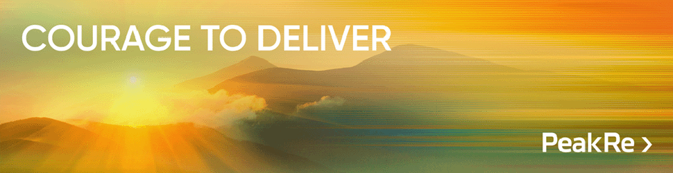
Peak Re’s corporate tagline is “Courage to Deliver.” It can be used across internal and external channels to express our brand personality — entrepreneurial and insightful — and our commitment to staying ahead of changing market needs.
The arrow motif in <Re> is a distinctive and powerful element in our industry, helping Peak Re stand out among competitors whose names also include “Re.” It reflects our ambition and purpose, symbolising our drive to reshape, revitalise, reinvent, redefine, and reimagine the reinsurance landscape. This graphic element is used across report dividers, promotional videos, digital channels, and advertising to reinforce our innovative, forward-thinking operating philosophy.


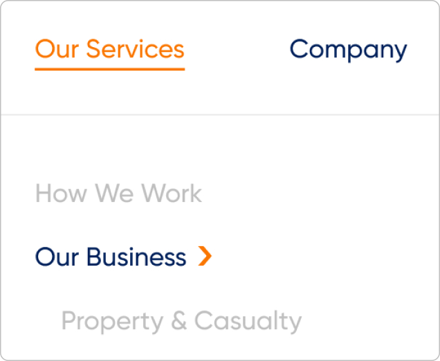
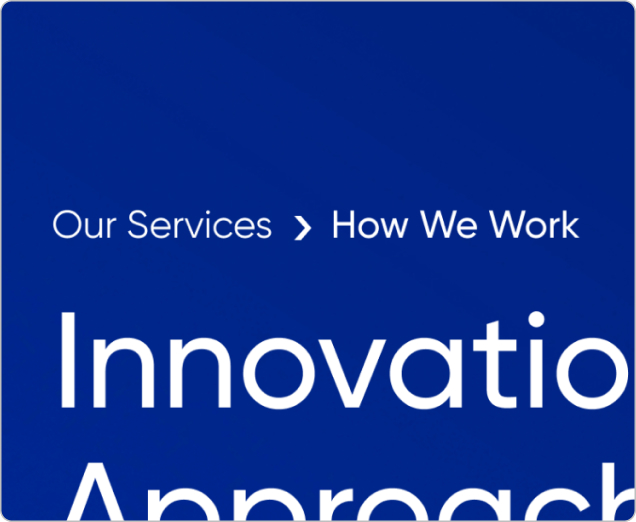
The arrow motif, thoughtfully integrated across Peak Re’s website, enhances navigation menu, breadcrumb, subtitle, and button. More than a visual element, it seamlessly blends form and function, subtly embodying our innovative brand spirit through every user interaction, fostering a dynamic and engaging digital experience.


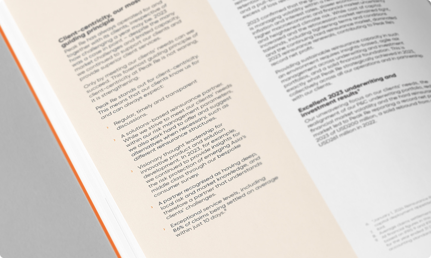
The arrow motif could serve as a bullet point in Peak Re’s printed materials, such as annual reports and brochures, subtly integrating our brand identity into text-heavy content.
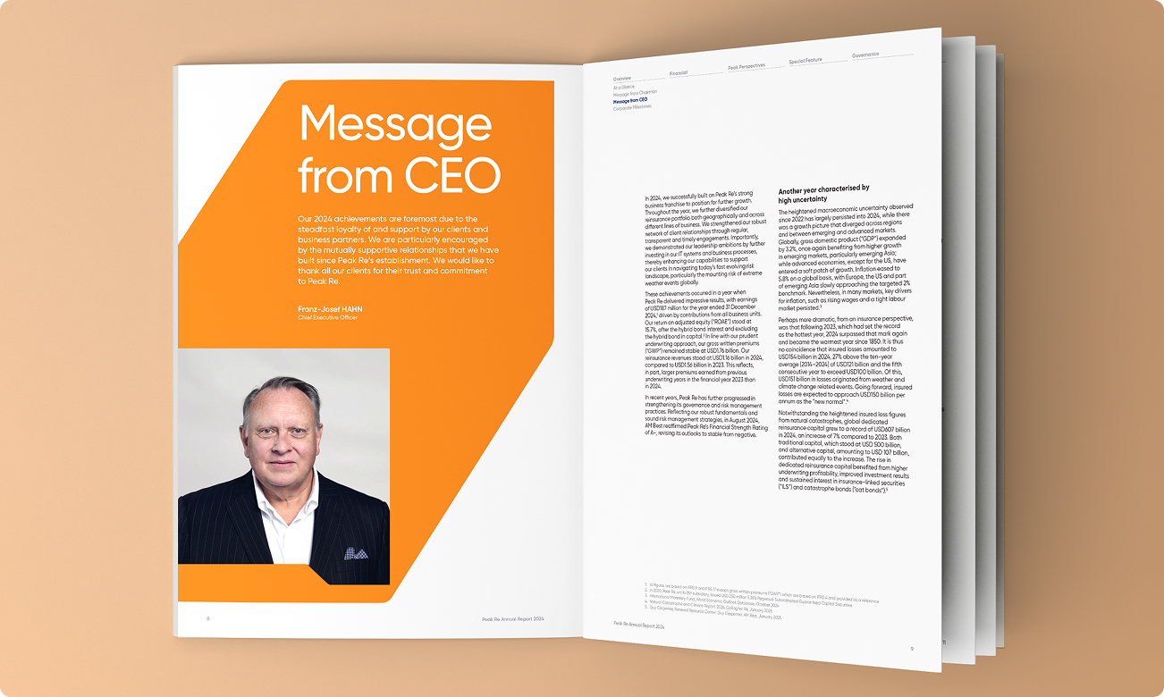
The arrow motif is not limited to small-scale use in Peak Re’s publications. As a bold, layered graphic, it highlights key content with striking clarity, preserving a sleek and modern look.
Beyond a standalone element, Peak Re’s arrow motif doubles as an image container, subtly blending into layouts. This refined approach enhances photos with a distinctive design touch, elevating the brand’s visual expression.