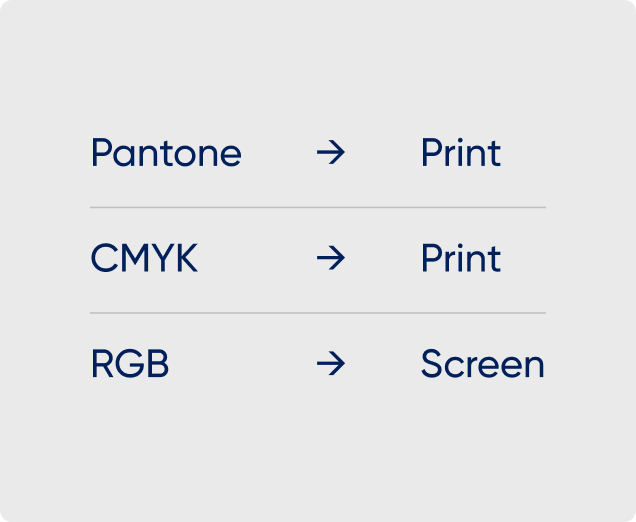
Our brand colour palette, centred on Peak Re Orange, embodies a bold expression of our mission to redefine insurance. Complemented by Peak Re Blue, our dynamic use of colour breaks boundaries, balancing simplicity and boldness with agility and insight, reflecting Peak Re’s innovative and client-focused identity.

Peak Re’s primary colour embodies our brand, accentuating our logo, key graphics, major data points, and pivotal brand moments, ensuring instant recognition with an innovative, client-focused spirit.
Peak Re’s accent colour adds contrast and selective emphasis, enhancing small UI elements like CTAs, supporting text, and subtle backgrounds. It complements orange, adding depth to our vibrant, client-centric compositions.
Peak Re’s neutral colours provide structure and readability, forming subtle backgrounds and clear body text or footnotes. They contrast with primary and accent colours, supporting vibrant, client-focused charts.
Peak Re’s secondary colours enhance our brand’s communication materials, used exclusively in illustrations to add vibrant visual impact, enriching the overall narrative with dynamic, client-centric flair.
Start and end with Peak Re Orange, our vibrant hallmark that conveys a bold introduction and memorable close. Introduce the secondary palette after establishing green, subtly intensifying its use in publication infographics to enhance engagement, embodying Peak Re’s dynamic and innovative identity.


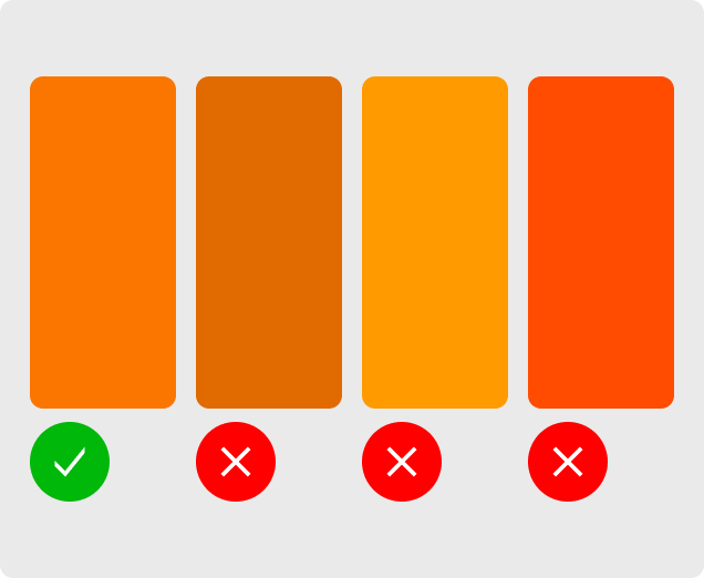
To maintain consistency and precision in typesetting, adhere to our guidelines and avoid the following practices, ensuring alignment with Peak Re’s innovative brand identity.