Our iconography system is a functional and visual tool that creates hierarchy, breaks down complex information, and intuitively guides the user’s eye across communications.
Our icons are defined by a consistent, thin stroke weight. This reflects precision and simplicity, ensuring clarity and scalability across all applications—from digital interfaces to printed materials. This style is often used functionally for navigation and information.
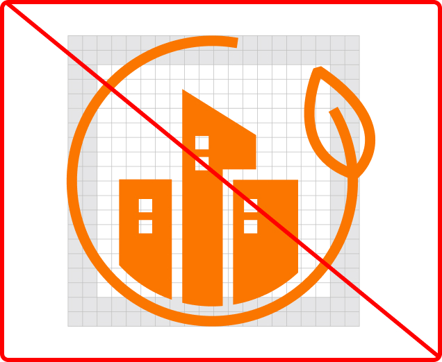
An illustrative icon style is available for moments requiring heightened emphasis. Featuring a solid fill and a sharp diagonal cut—a direct nod to our arrow motif—this style adds visual weight and dynamic energy to key content. Use this to draw attention to key content or to create visual emphasis where needed.
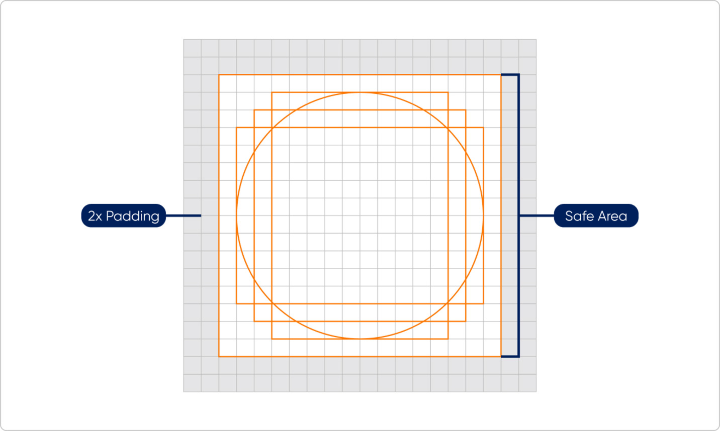
Peak Re’s 20x20 icon grid ensures consistent design guidelines. As our icons form a cohesive set, maintaining visual uniformity is essential for clear, unified branding.
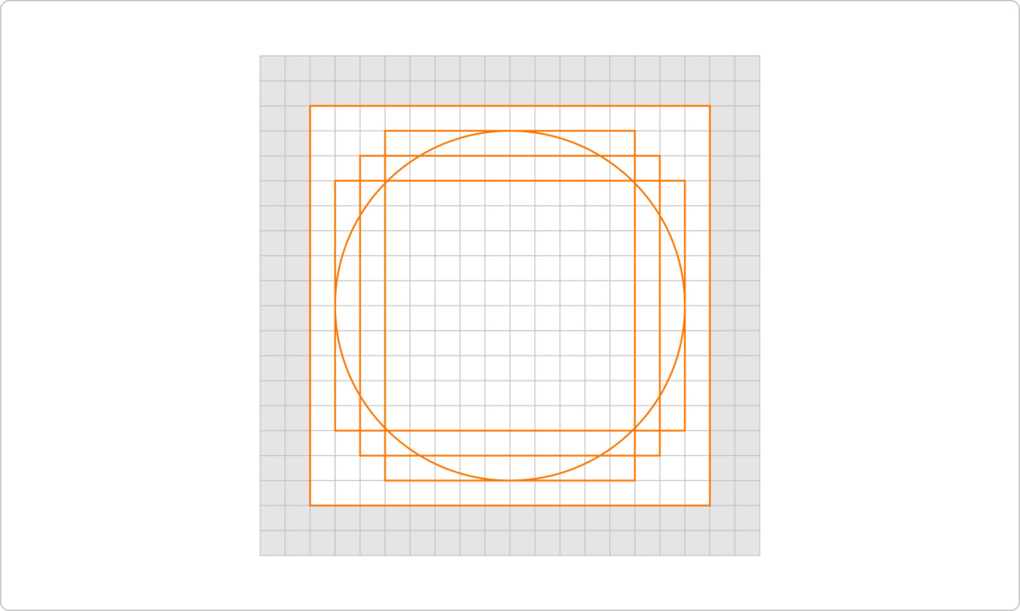
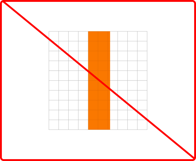
The grid includes 2x2 padding, ensuring icons maintain scale and surrounding whitespace upon export.