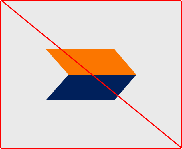
Our illustration delivers clear visual cues, guiding the eye with precision and enhancing content clarity in Peak Re’s designs
Our custom illustrations serve as powerful storytelling tools that amplify key messages and bring our visual communications to life with energy and brand personality. They transform complex ideas into engaging, accessible visuals that connect with our audience. Use these illustrations to add narrative depth, highlight innovation, and create distinctive visual moments that set the Peak Re brand apart across all touchpoints.

Our illustration delivers clear visual cues, guiding the eye with precision and enhancing content clarity in Peak Re’s designs
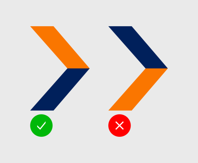
Arrow graphic embodies dynamic movement, propelling Peak Re’s designs forward with energy and a sense of progressive flow
The arrow illustration fosters connection, subtly linking Peak Re’s brand identity with users through engaging, cohesive visual interactions
Arrows reflect Peak Re’s insightful approach, highlighting key information with clarity to spark understanding and drive impactful engagement
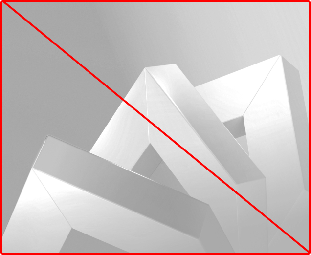
Drawing from Peak Re’s dynamic arrow motif, we craft bold 3D visuals to embody the brand’s agile and innovative spirit. Infused with vibrant brand colours and fresh perspectives, these graphics tell a compelling story of how Peak Re redefines the reinsurance landscape with impact and vision.


Peak Re's annual report key visual evolves each year around a distinct theme, delivering fresh perspectives and insights to inspire and inform. Stay attuned to the latest iteration and integrate its style across that year's applications—like event invitations and social media posts—to ensure an unified visual expression that amplifies our agile, innovative brand.


To maintain consistency and precision in typesetting, adhere to our guidelines and avoid the following practices, ensuring alignment with Peak Re’s innovative brand identity.