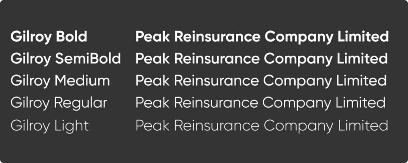
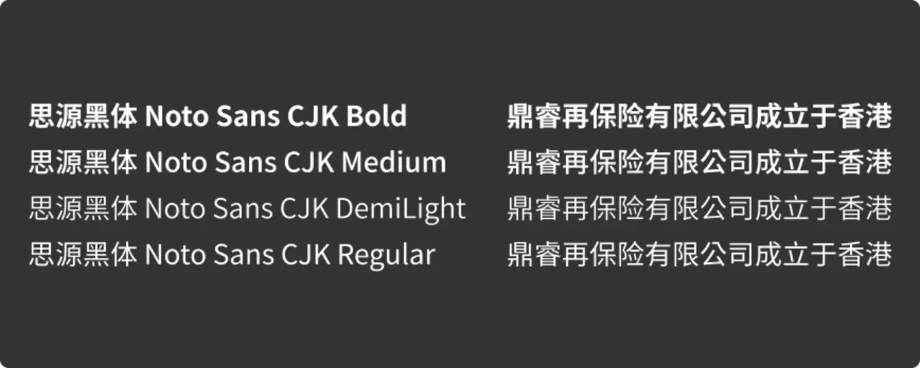
Our typographic approach, anchored by our brand typeface, Gilroy, establishes a dynamic and versatile system that ensures precision and consistency across all designs. It empowers bold, experimental typographic expressions that challenge conventions, fostering innovative compositions that captivate and align with Peak Re’s forward-thinking, client-centric identity.

Our brand fonts should be used throughout all professional designs and external marketing communications, such as corporate brochures and advertising media.


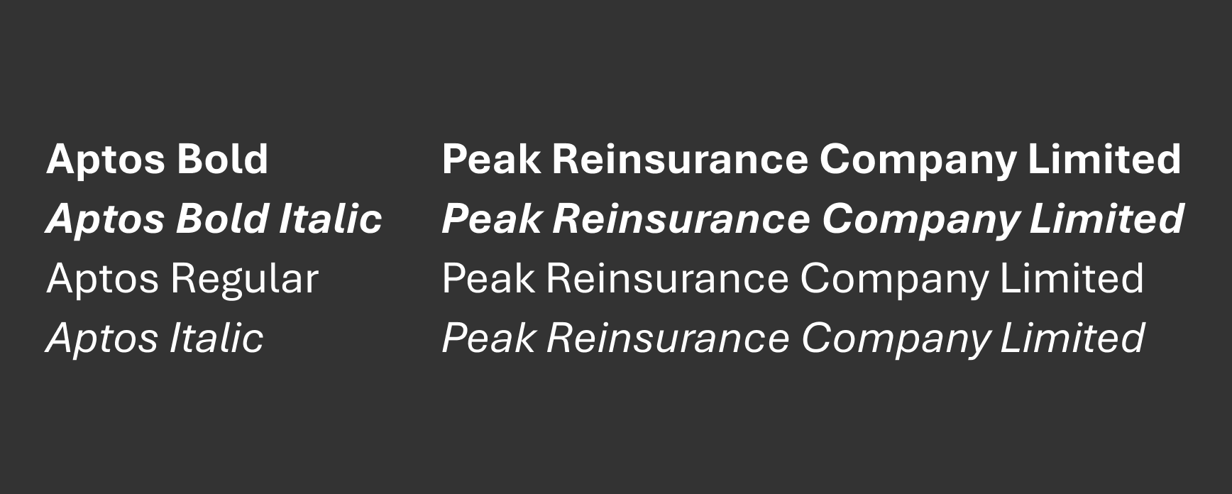
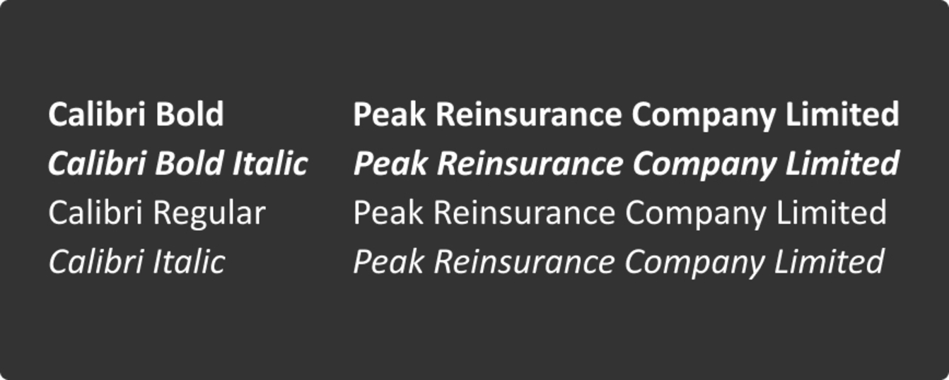
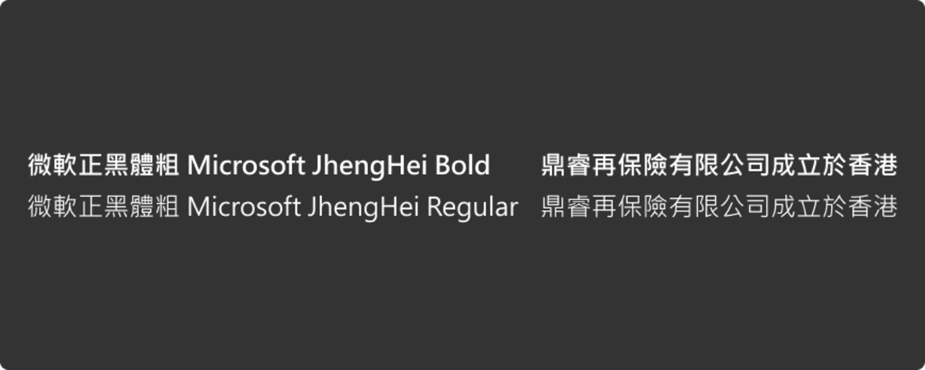
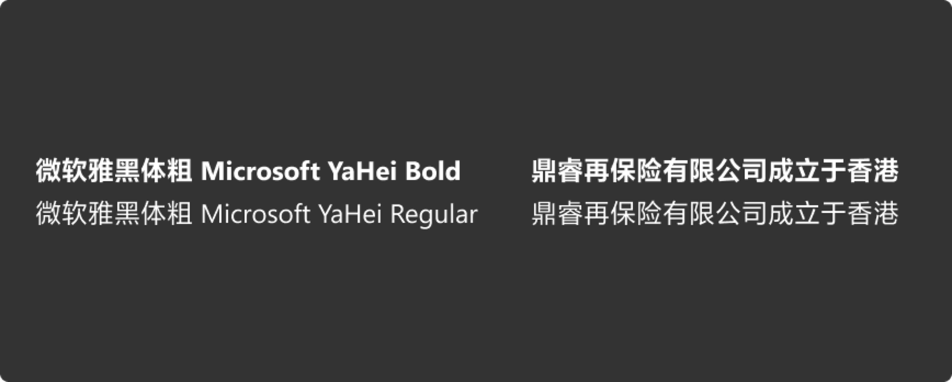
For internal emails and other technical use cases where our corporate fonts aren’t available, please use the default system fonts pre-installed on Microsoft devices and applications (e.g., Aptos or Calibri, as shown in the images below). In these cases, keep the template’s default/auto font settings.
Do not use system fonts for professional design work or any external marketing communications.
For applications requiring expressive design, leading and tracking guidelines can be flexibly applied to transform typography into a distinctive graphic element. Our approach focuses on seamlessly integrating typography into the layout to enhance the overall composition, creating a visual dialogue between type and elements such as photography, illustrations, and negative space. Key elements to explore include spacing, dimensionality, repetition, contrast, orientation, and legibility. By pushing creative boundaries, our typography reinforces Peak Re’s commitment to innovation and impactful design.
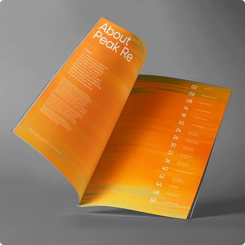
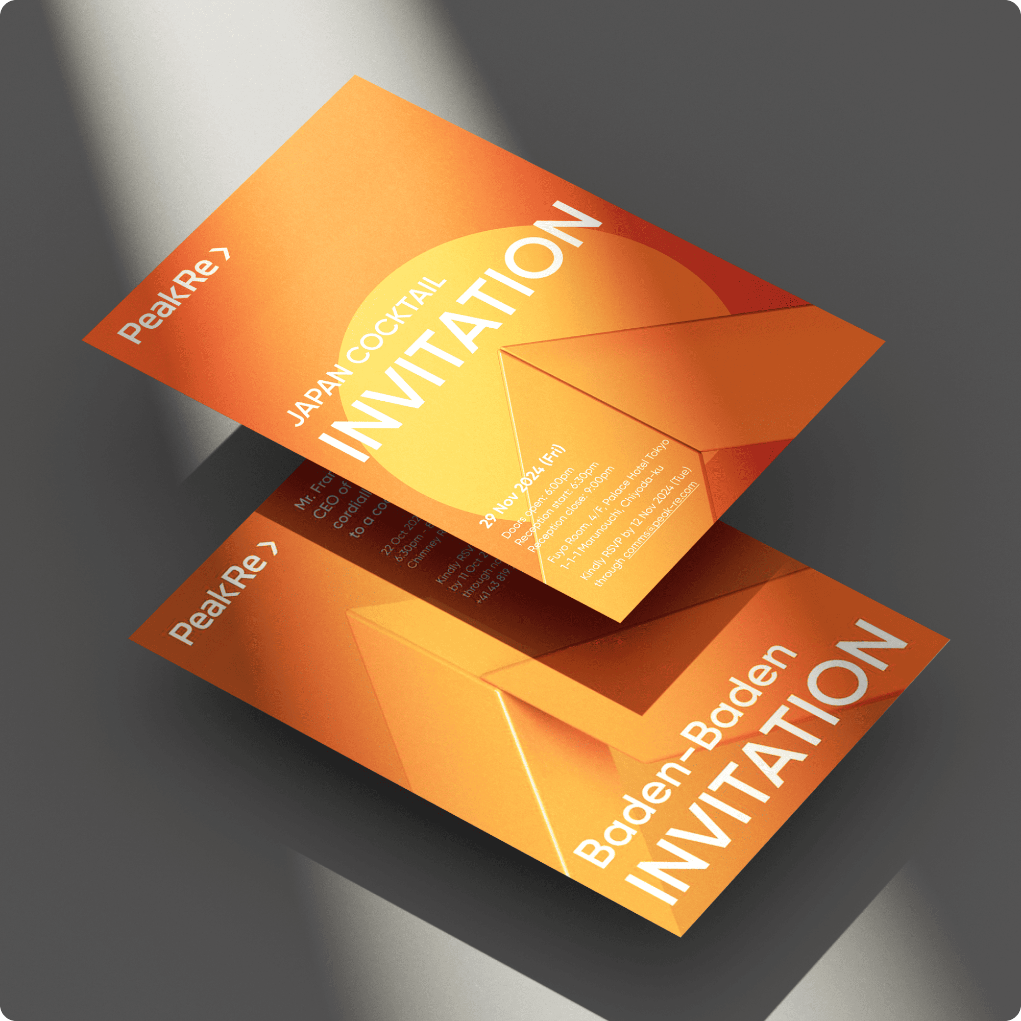
Typesetting
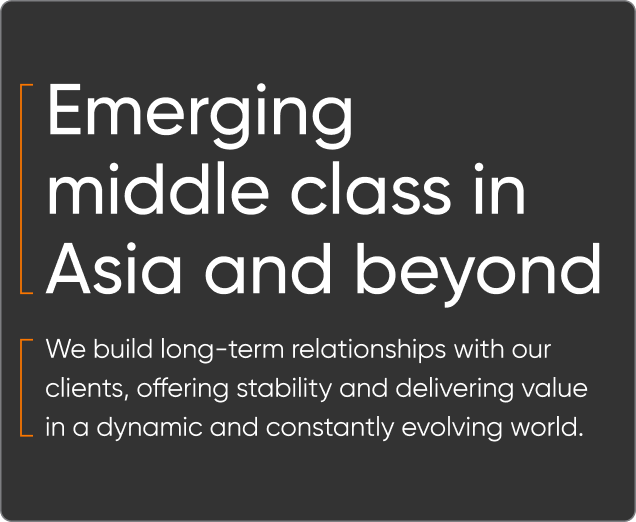
At Peak Re, typesetting is an art driven by precision and clarity, reflecting our innovative and client-focused identity. With a discerning eye, we ensure consistent alignment, spacing, and legibility, creating polished, engaging designs that uphold our brand’s dynamic standards.
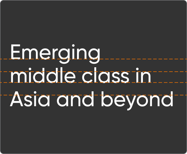
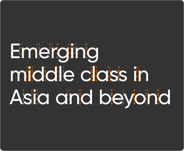
To maintain consistency and precision in typesetting, adhere to our guidelines and avoid the following practices, ensuring alignment with Peak Re’s innovative brand identity.